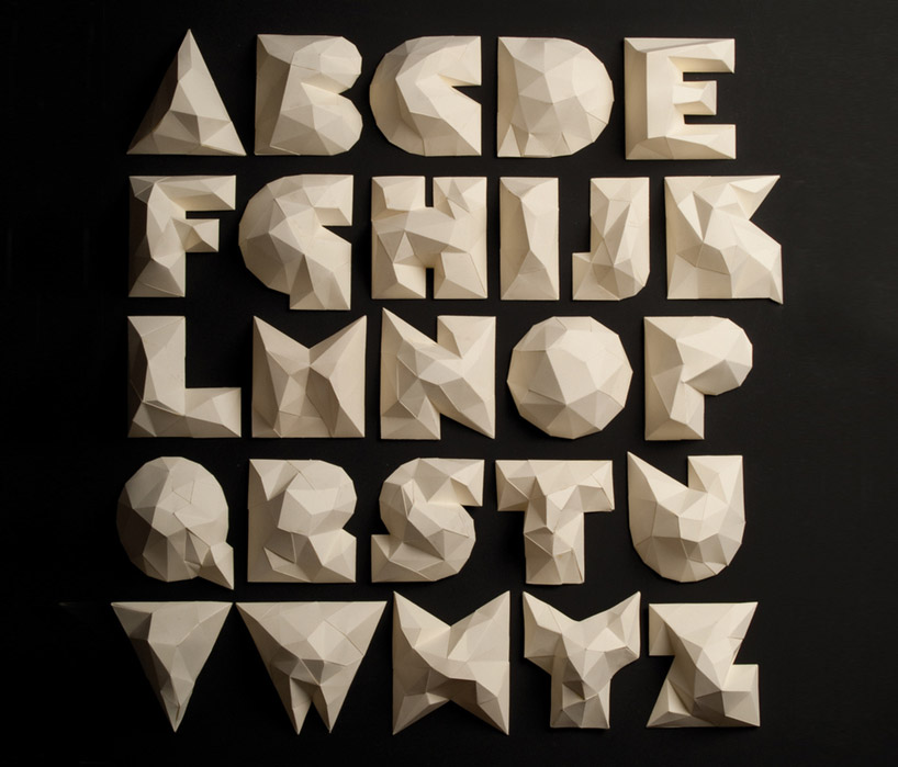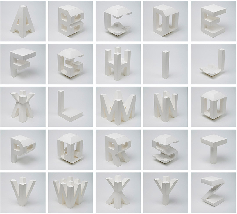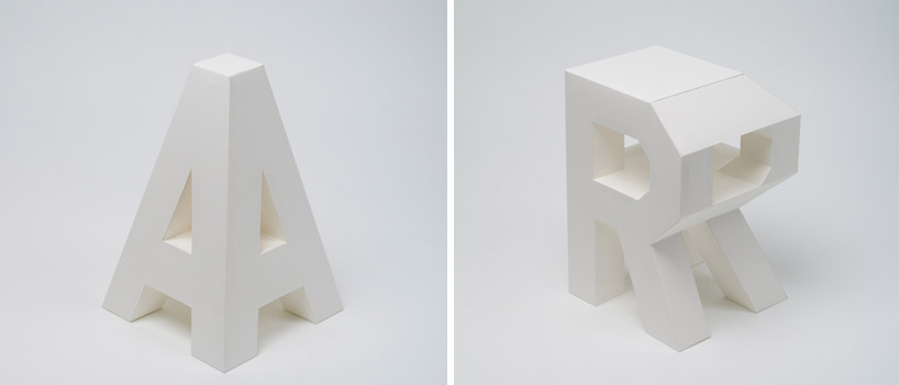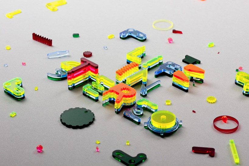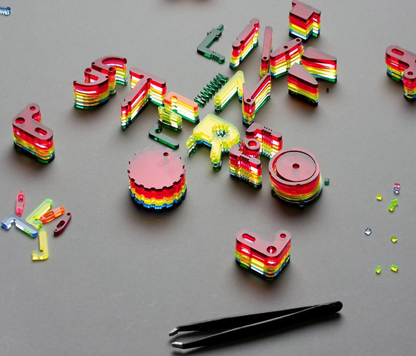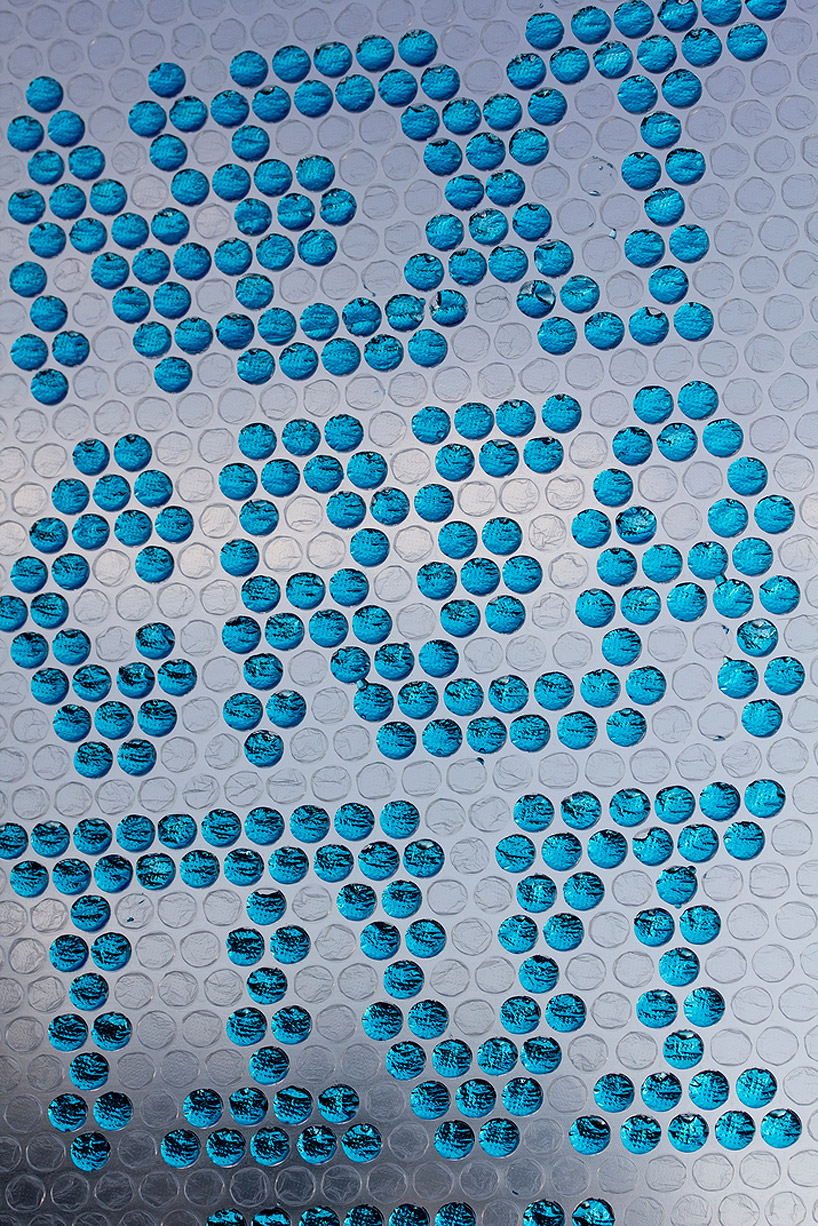
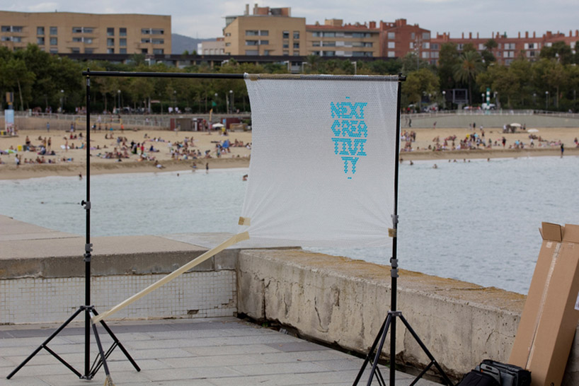

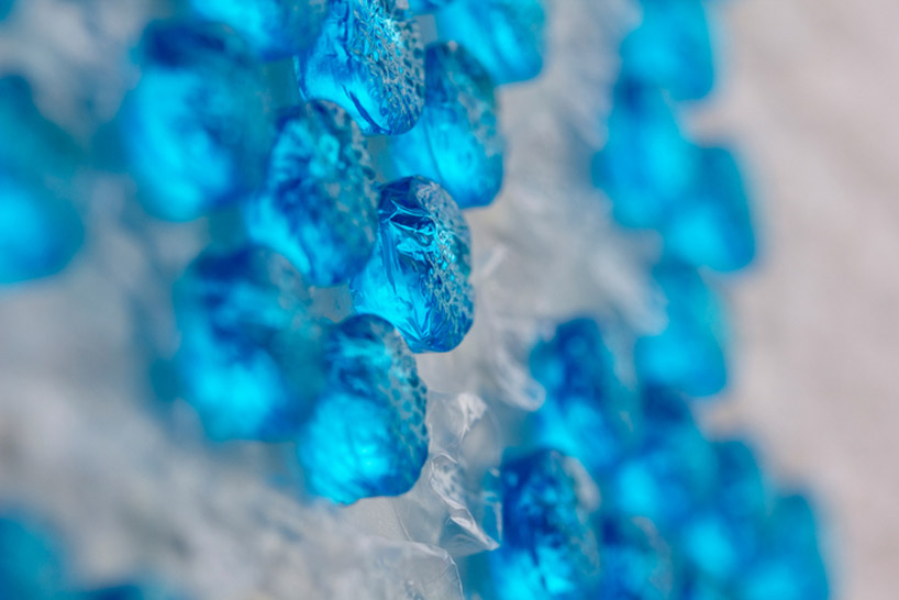
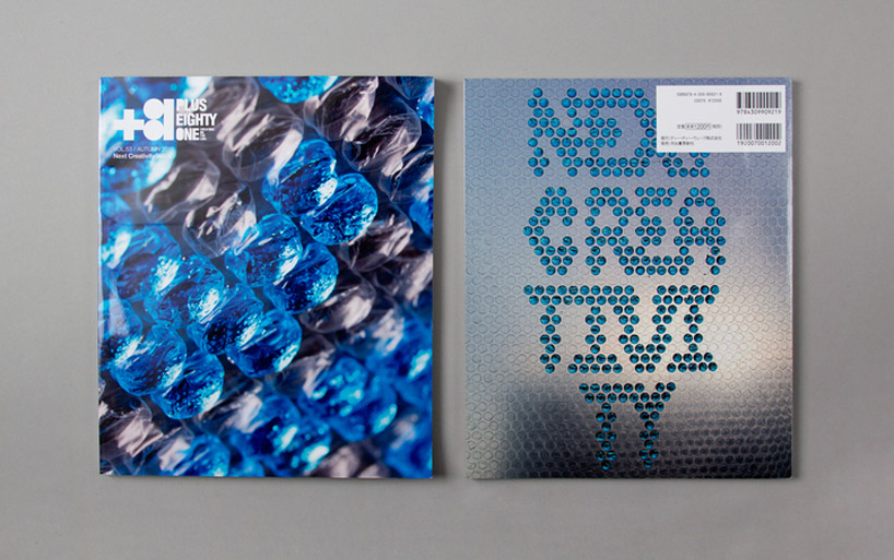
Spanish graphic design studio Lo Siento conceived the cover for japan’s +81 magazine, where the artist injects bubble wrap blisters with colored water to spell out the issue’s subject ‘next creativity’. The work is amongst a diverse range of typographical explorations – moving beyond the traditional realm of 2D to design for various identities and projects. While further below, ‘4D type’ is one concept that sees the idea of lettering to become viewable from all angles, or ’empo’, which is an alphabet created as part of an identity for an osteopathy office informed by the human body. As for the album cover art for the band ‘pinker tones’, we can see the colorful use of more raised objects that create differ type designs and typographical explorations.